Dulux chose Tranquil Dawn as its colour of the year for 2020, but something bolder would have better represented the year ahead, says Michelle Ogundehin.
Dulux’s colour of the year for 2020 – a hazy, muted green that recalls a sort of pale Chinese celadon mixed with sage and a smudge of grey – is intended to embody “our desire to treasure our most human qualities and give our homes ‘The Human Touch'”.
However, more than the actual colour it is the why behind the hue that interests me – the rationale of the process before the product, if you will. Quite aside from the complexity of trying to assign a single shade to represent an entire year.
Dulux‘s approach is nothing if not rigorous. Every year its parent company, Akzonobel, gathers an international team of independent architects, creatives and designers at its Global Aesthetics Centre in Amsterdam in order to debate the cultural and lifestyle shifts deemed significant for the year in question.
The brief is to compile as coherent a global picture as possible of the mood ahead. Last year, I was invited to join them. To be clear though, the translation of this three-days of brainstorming into physical colour is the remit of the in-house team alone, we’re just sketching the outline for them to fill in, so to speak.
The brief is to compile as coherent a global picture as possible of the mood ahead
Certainly, there was much to discuss, from the growing phenomenon of bio-hacking and the question of whether we’ve reached peak human, to what one participant dubbed, the Volatile, Uncertain, Complex and Ambiguous world.
The words of Ginni Rometty, the CEO of IBM were recounted: “you can be the disruptor instead of the disrupted”. Statistics like “47 per cent of today’s jobs will disappear in the next 25 years”, were shared. And we discussed the urban isolation seen in China, a result of the proliferation of virtual reality online services that render real life human interaction redundant.
But it wasn’t all bad. There was also the new wave of gentrification of China’s countryside as old houses in villages deserted by a generation’s exodus to the city are remade as luxurious guest lodges – slow retreats, in an ironic twist, for those now harassed urbanites to escape back to. Plus, the possibility of a shift from a consumer society to a creative one, and the emergence of the Elastic Woman, the now 50-60-year-old baby boomers who refuse to conform to any ageist stereotypes.
The rationale for Tranquil Dawn hinged on rediscovering what makes us human.
In summary, things were messy, but there was a glimmer of hope and optimism visible just over the horizon. After the dark, must come the light, no? But how does this all add up to a laconic misty green?
Certainly, all things “green” are the narrative of the times. Pinterest noted back in 2018 that sage green saves were up 170 per cent, and as issues of sustainability hit the mainstream and campaigning about the environment gets ever more vocal, even business behemoths like Unilever have stated that its entire portfolio of over 400 brands “will need to demonstrate viable corporate social responsibility goals in order to remain part of the group in the long-term”.
Nevertheless, the rationale for Tranquil Dawn hinged on rediscovering what makes us human. And this is a markedly different stance to that of trend forecaster WGSN, which predicted Neo Mint as the colour for 2020 – a shade superficially similar to Tranquil Dawn in its minty-ness but with a far more strident edge, less fresh than fluorescent.
As WGSN put it, “For years we’ve been imagining life in 2020, and now the worlds of technology and science are turning these dreams into reality”. It cited the NASA Mars mission, the building of the world’s tallest building in Saudi Arabia and the introduction of artificial intelligence to assist judges at the Olympic games as evidence of technology’s beneficence.
We are after all in the midst of what has been dubbed the Age of Anxiety
This is a rather idealistic stance, and one that immediately brings to mind American satirist H L Mencken’s scathing put down: “an idealist is someone who, on noticing that a rose smells better than a cabbage, concludes that it makes better soup”.
We are after all in the midst of what has been dubbed the Age of Anxiety. An era in which the superficial seems to reign supreme, infamy is more desirable than respect, consumerism is promoted at every turn and the digital realm appears to have superseded reality.
Have you watched the Netflix documentary The Great Hack? If not, I highly recommend that you do, because, as this film asserts, data is becoming the most valuable asset on earth, and yet it’s the one thing that we as individuals have no power to own yet give away with every single digital interaction.
We need think only of the ease with which highly polarising, filtered “news” was used to target, influence and persuade the unsuspecting to understand why this should be cause for concern. In short, instead of delivering a glorious collaborative utopia, right now, the dream of the connected world, is tearing us apart.
In response, according to Heleen van Gent, head of AkzoNobel’s Global Aesthetic Centre: “Against a background of increasing technological power, we want to understand our place in society and how we can make a positive impact on it. We need fresh purpose, to be the architects of our own future, and we are asking searching questions of both ourselves and society.”
Tranquil Dawn is more of a cool neutral, than a statement shade, what I’d refer to as a subconscious colour
So, could all things ‘green’ be the glue that sticks us back together? Certainly, the US-based Behr paints concur with Dulux. In August it announced its 2020 Colour of the Year as Back to Nature S340-4 describing it as a “fresh and slightly yellow-based green [that] serves as an ideal backdrop to satisfy the desire for a soft landing at home… a great option for adding peace and tranquillity to any space”.
Indeed, from a psychological point of view most shades of green do automatically recall lush grass, trees and foliage, thus we intuitively connect it with Spring, new growth, optimism and rebirth. “We are reassured by green on a very primitive level,” says colour psychologist Karen Haller, “Where there is green, we can find food and water – it equals life.”
It sits at the centre of the colour spectrum too making it restful for the eye; in other words, we don’t have to work too hard to see it, so it’s intrinsically calming, which is why you see pale green used a lot to paint the walls of hospital wards.
But lest we forget, green also connotes jealousy, decay and sickness, thus the precise shade of green chosen is paramount. After all, contrast the stealthy allure of British racing green with the zesty reverberation of a vivid lime.
I’d have preferred a slightly punchier, dirtier green
Simplistically put, the former is mixed with black, thus deepened, slowed and given a sophisticated solidity; less the green shoots of spring than the ancient fir forests of Scandinavia. And the latter, energised by a generous dollop of yellow, has a shouty, look-at-me absence of subtlety that calls to mind highlighter pens and sugar-fuelled fizzy drinks. Both greens, but miles apart in their resultant emotive affect.
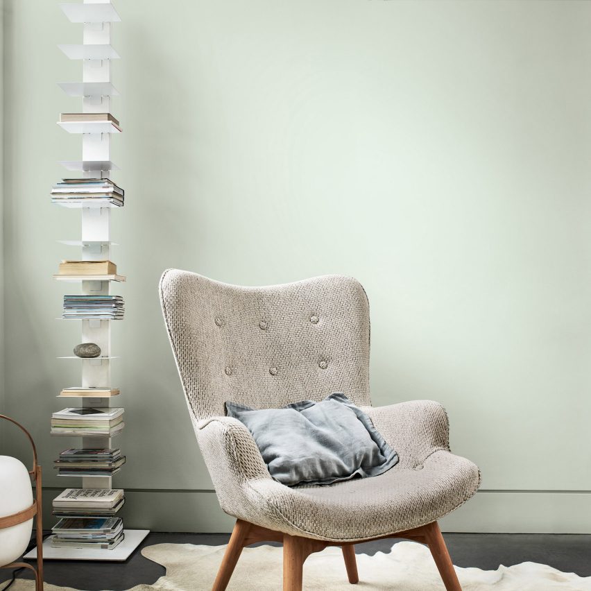
Thus, Behr’s Back to Nature veers dangerously towards the sickly with its subdued yellow undertones; and Tranquil Dawn, goes to the other end of the scale, being a seriously dialled-down green with base notes of smoky blue. It’s more of a cool neutral, than a statement shade, what I’d refer to as a subconscious colour, in that it’s there, but it’s only whispering for attention, happy to hum along in the background, without overwhelming.
Arguably we could say that it speaks well of collaboration because it works best as part of a palette; it’s a team-player rather than a leader, eminently tasteful, diplomatic and flexible, and no doubt it will have universal commercial appeal. In short, it’s a natural comforter rather than a provocateur, hinting at success rather than overtly promising it.
However, I think Dulux could have been bolder. A year ago perhaps there was more optimism about the future, but right now, as we still lack the strong governmental leadership that we so sorely need, the goal must be self-empowerment, something evidenced already in the escalating number of people’s marches, rebellions and protests seen all over the world.
Thus, I’d have preferred a slightly punchier, dirtier green, as one thing is for sure, it promises to be anything but a tranquil dawn to 2020.
The post “Could all things ‘green’ be the glue that sticks us back together?” appeared first on Dezeen.